Ajenda
Brand identity for a stationery line built on structure and play.
Project Type
Branding Design
Role
Designer
Year
2024

Brand identity for a stationery line built on structure and play.
Project Type
Branding Design
Role
Designer
Year
2024
Ajenda is a stationery brand built on a belief that everyday tools can spark creativity. More than just notebooks and pens, the brand offers objects designed to inspire, combining clean aesthetics with thoughtful function.
The goal was to create a visual identity that reflects this balance: structured enough to feel reliable, playful enough to feel inspiring.
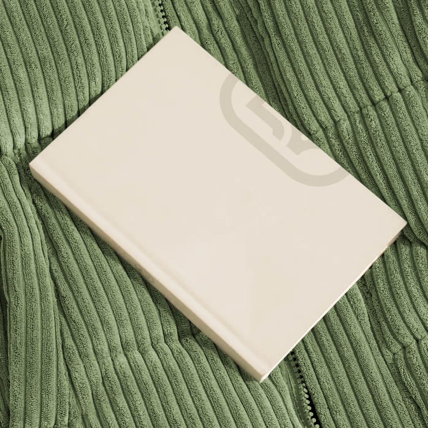
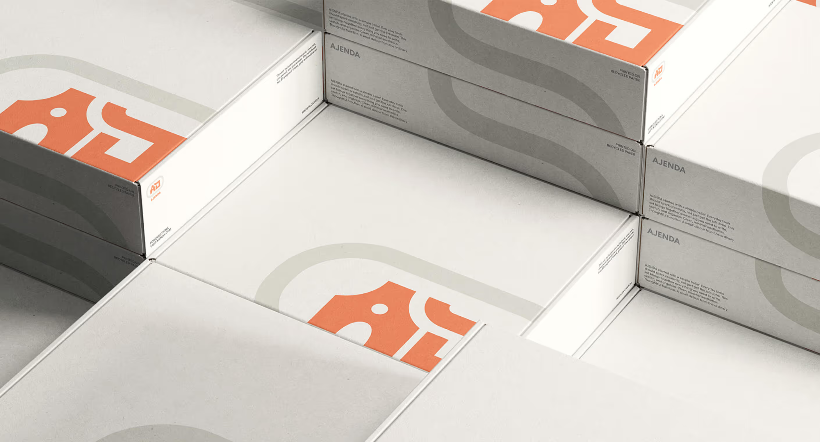
When I found out I'd be creating a logo for a stationery brand, I was genuinely excited. Stationery is something I've always loved, its ability to encourage creativity and the craftsmanship that goes behind it. I wanted the logo to capture that feeling.
The name Ajenda came from playing with the word "agenda", structure, routine, organization, but swapping in a J to make it unexpected and unique. A creative twist, like the ones good stationery can bring.
RGB 245, 129, 86
HEX #F58156
CMYK 0, 61, 70, 0
RGB 220, 218, 205
HEX #DCDACD
CMYK 13, 10, 18, 0
RGB 255, 255, 255
HEX #FFFFFF
CMYK 0, 0, 0, 0
RGB 116, 116, 116
HEX #747474
CMYK 56, 47, 47, 12,
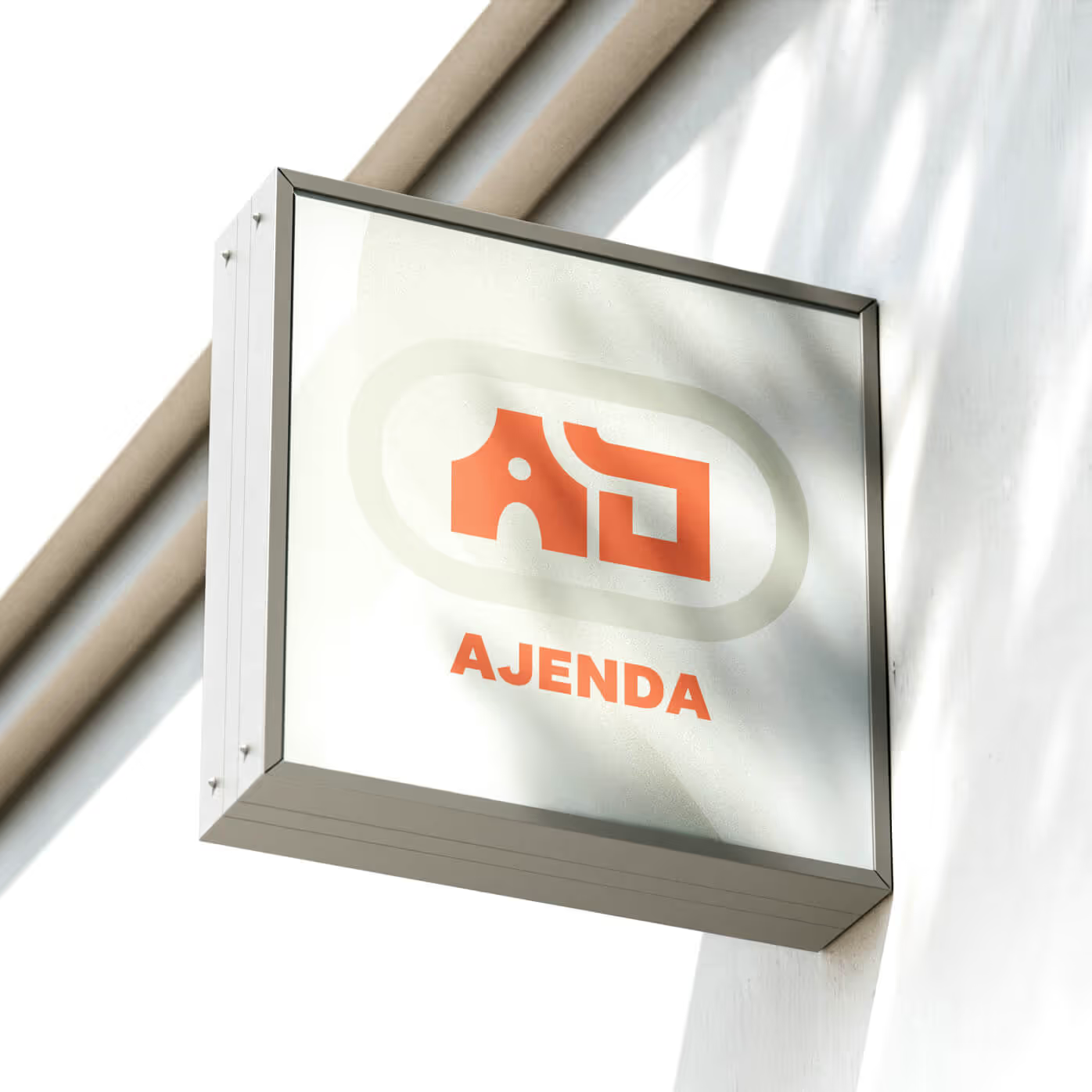
The "AJ" mark locks together like a stamp, working at any size. The A curves like a pen tip. The J balances geometry with a soft turn. A friendly orange adds warmth, while neutral tones keep it grounded.
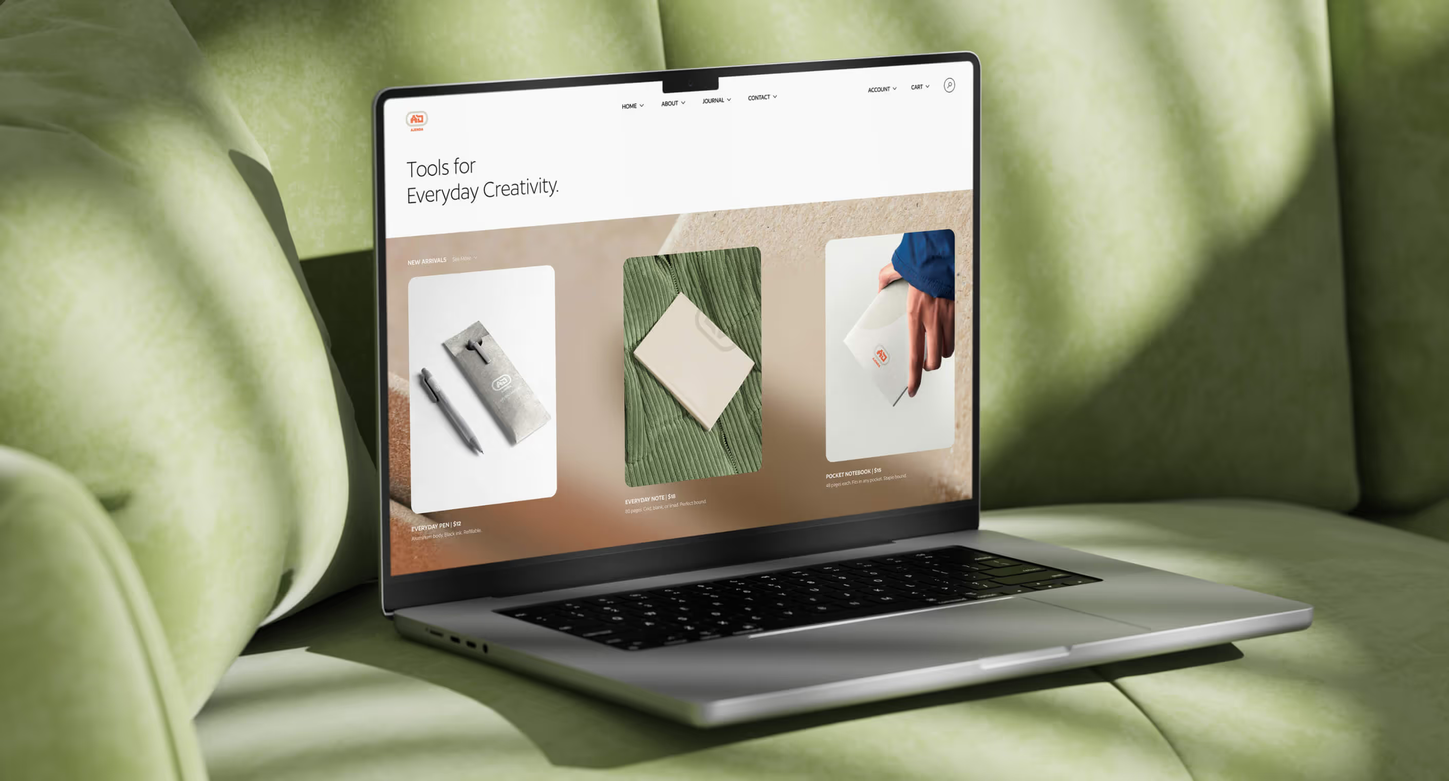
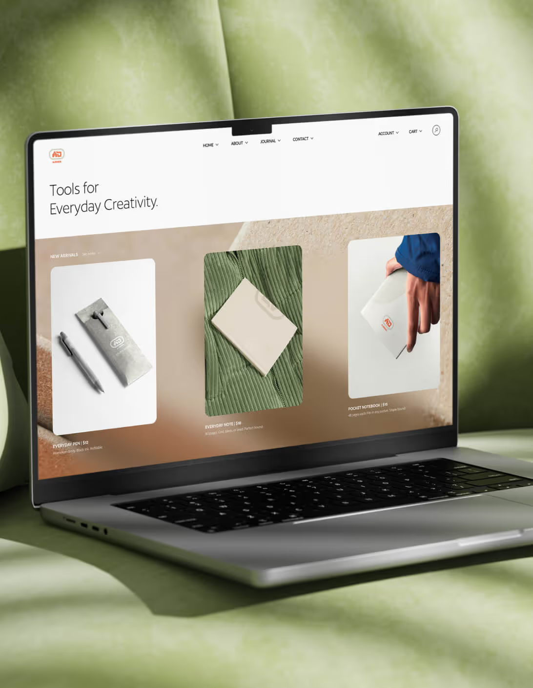
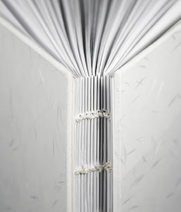
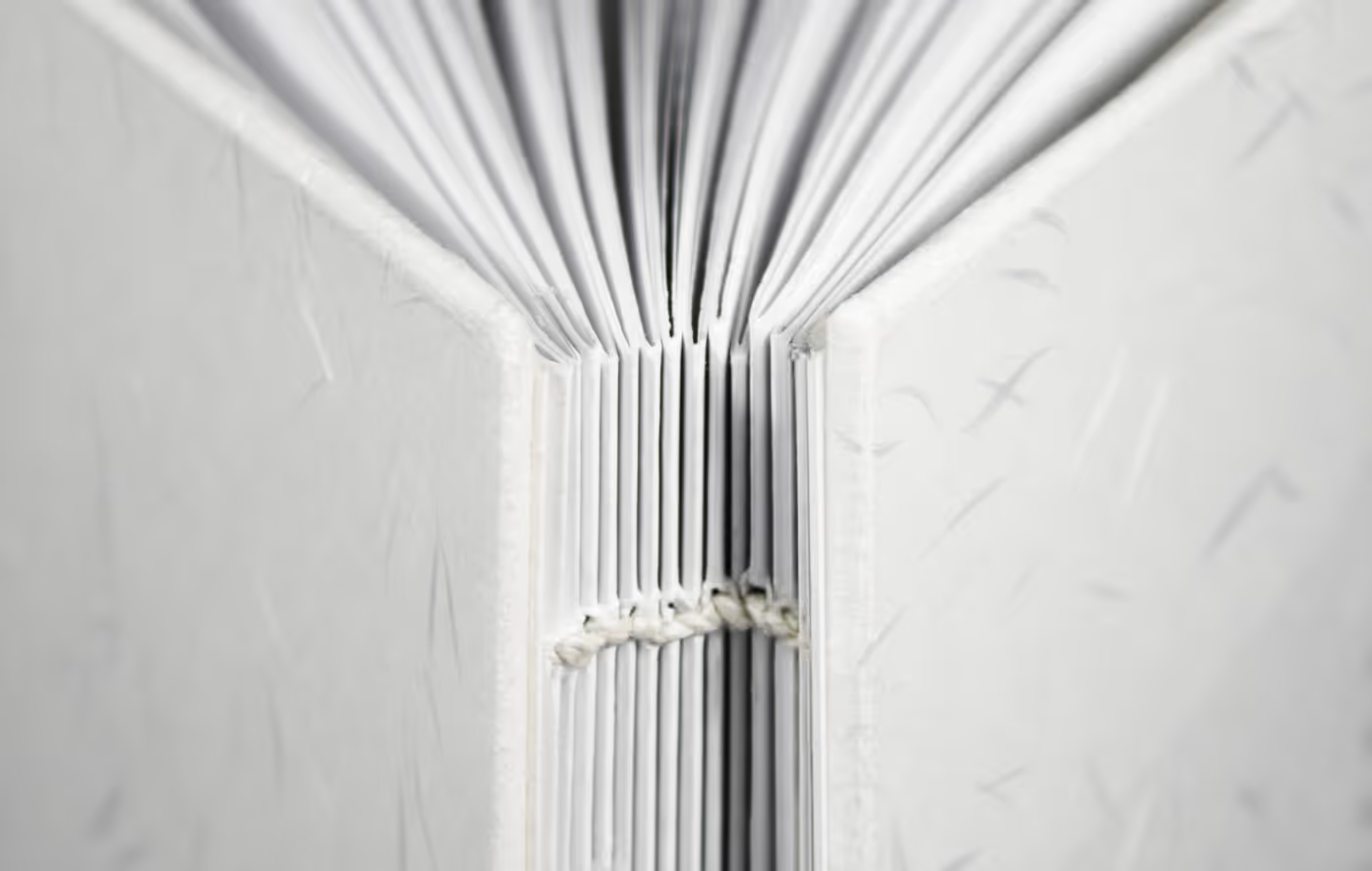
The system extends across notebooks, packaging, and digital touchpoints. Balanced. Functional. Built for everyday use.