Fine Syrup
Organic maple syrup packaging where the land writes the story.
Project Type
Packaging Design
Role
Designer
Year
2025
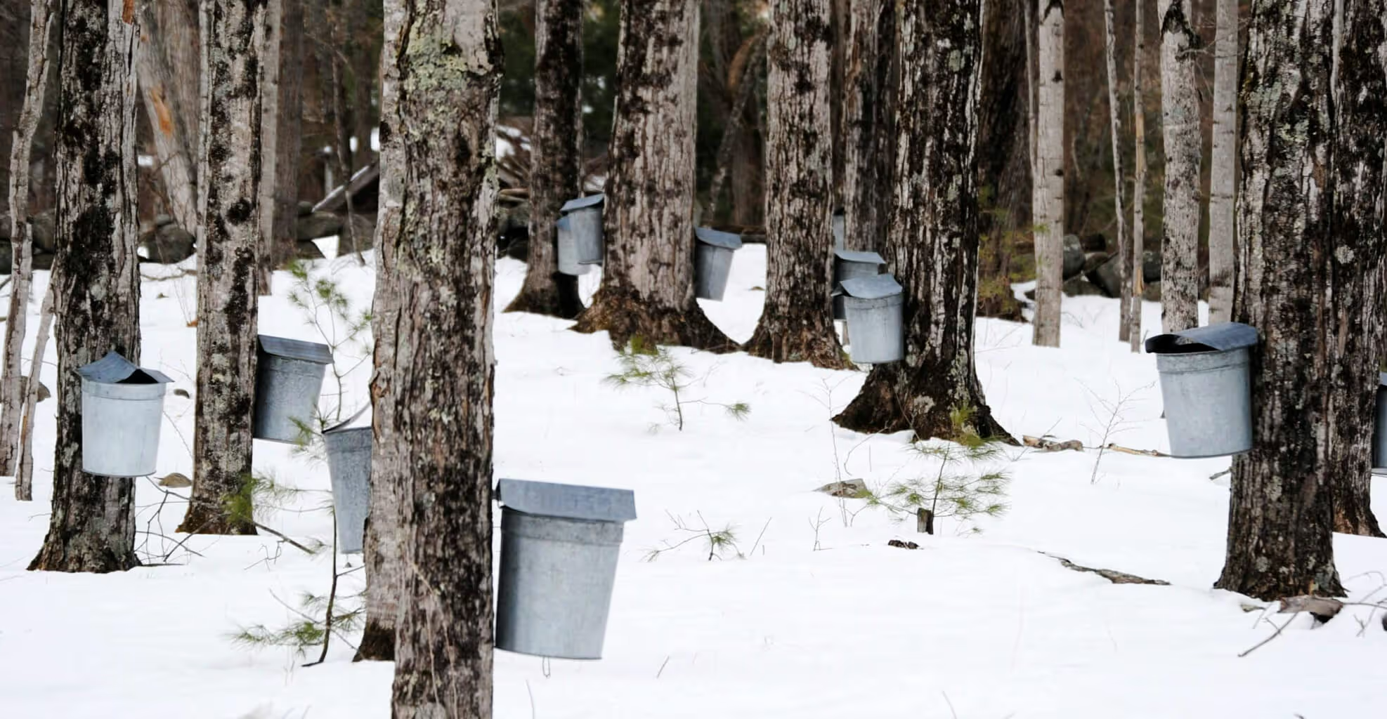
Organic maple syrup packaging where the land writes the story.
Project Type
Packaging Design
Role
Designer
Year
2025
Reimagine the classic 540 ml maple syrup tin for a contemporary audience. The goal: communicate organic, forest friendly harvesting and ecological responsibility without relying on clichés.
The design needed to feel premium, transparent, and rooted in authenticity while working within the constraints of the traditional tin format.
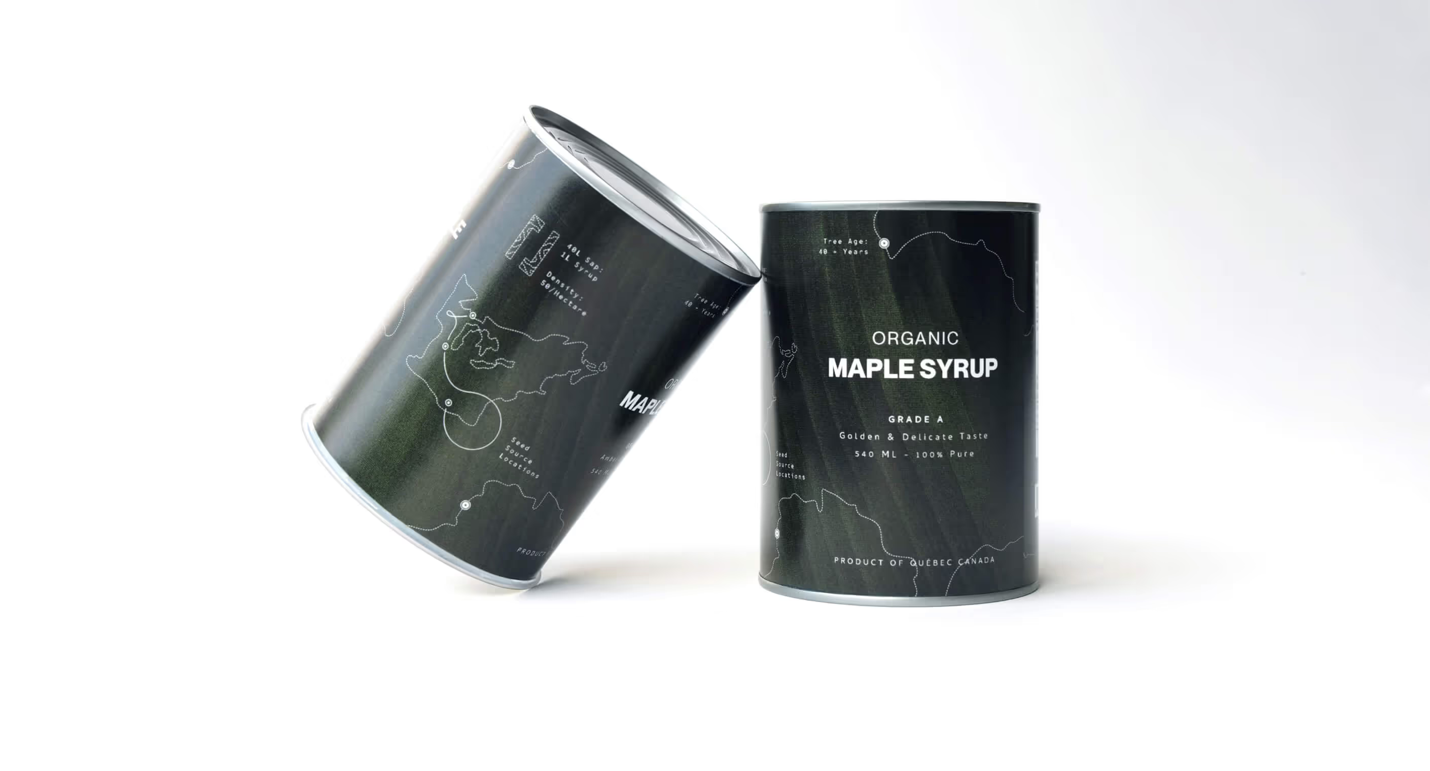
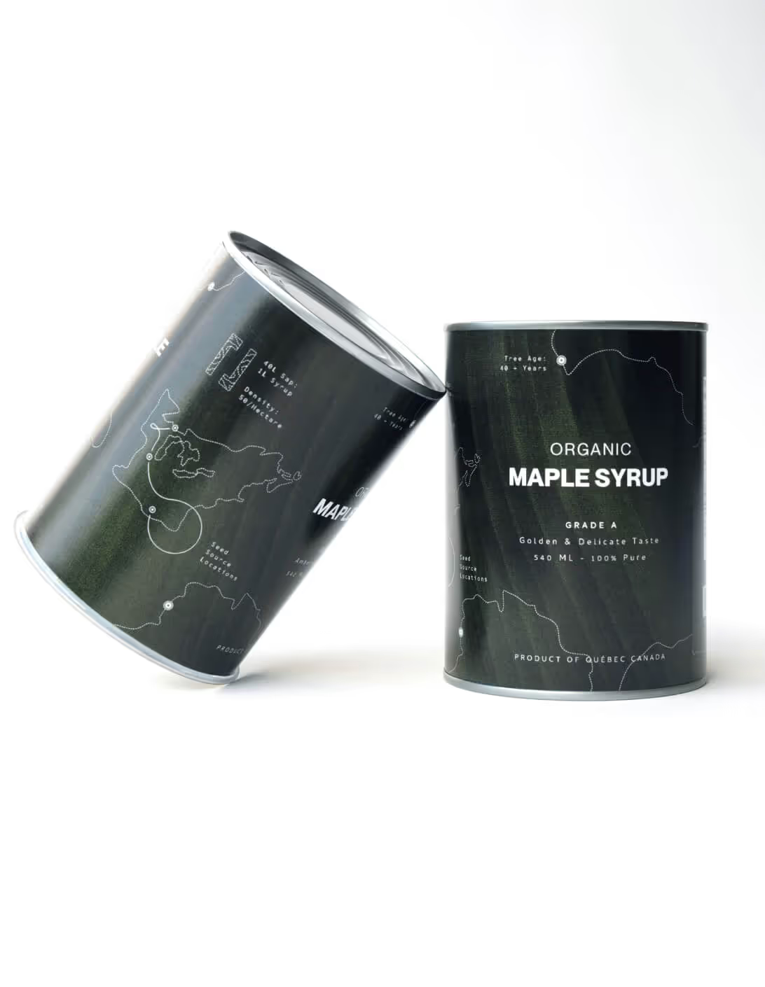
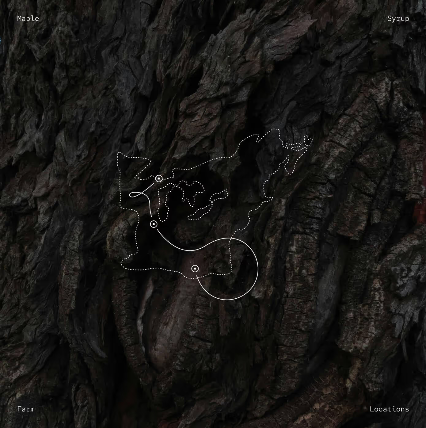
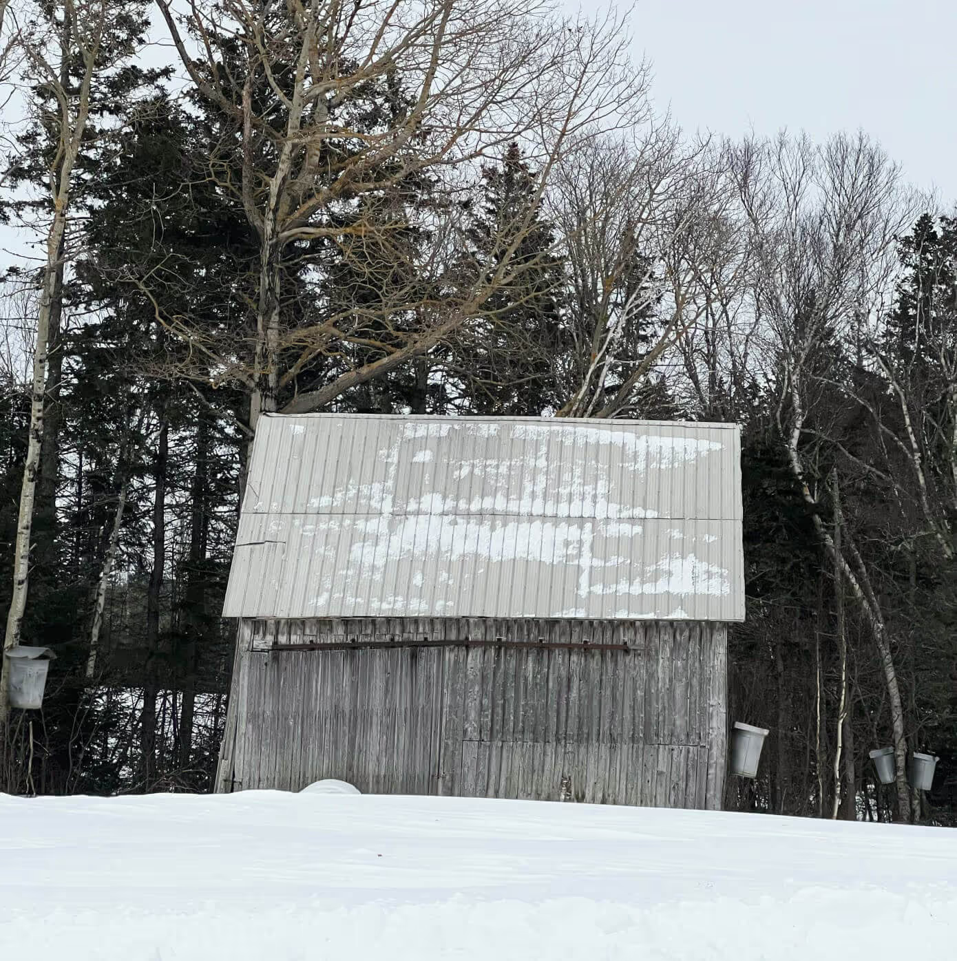
Maple syrup has a unique story and place here in Canada, and I wanted to explore that authenticity. I thought about the beauty of the forest and all the lines flowing through it holistically. Roots, leaves, wood grain, maps. That line of thinking led me to the concept of forest data.
GPS coordinates, forest stand age, tree density. Not hidden on the back, but placed into the label itself. For consumers who value integrity, it grounds the product in traceability and truth.
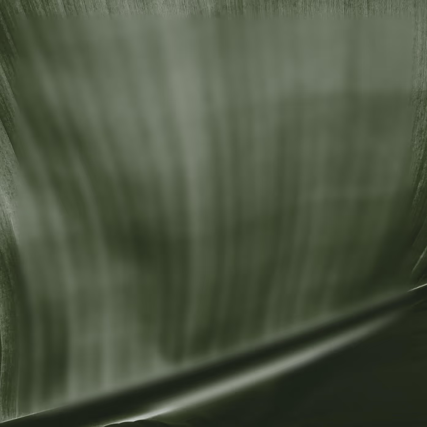
A gloss printed label with a dark green textured background. It feels elegant, but the texture pulls you back to the forest. An actual forest map illustration is integrated, showing the range of several maple farms.
Statistical points scatter throughout, map lines flowing like roots underground. Sans serif type keeps everything modern and reliable.
The tin becomes a record of where it came from.