STM Re:Route
A refreshed visual identity for Montreal's public transit network.
Project Type
Branding Design
Role
Designer
Year
2026
A refreshed visual identity for Montreal's public transit network.
Project Type
Branding Design
Role
Designer
Year
2026
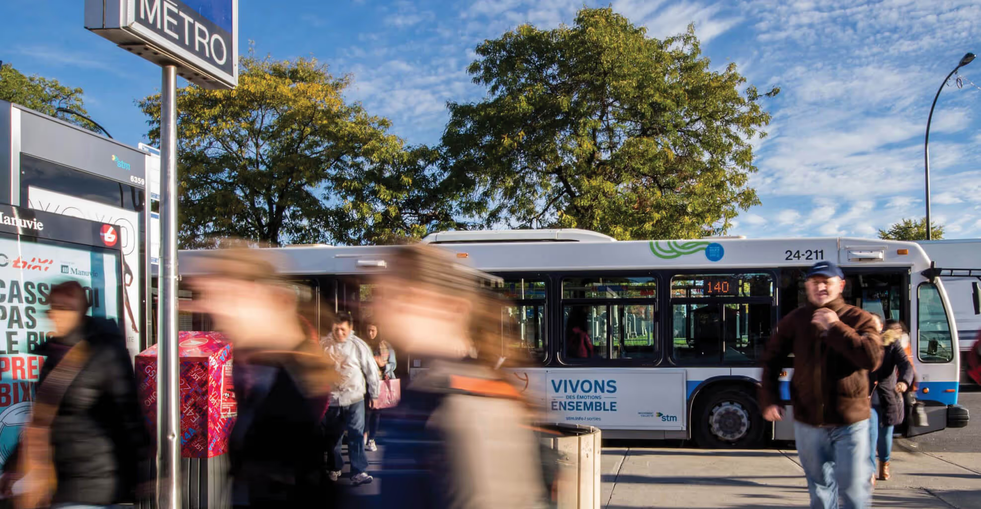
Montreal's transit system is growing. New lines, expanded services, and a public commitment to sustainability. But the visual identity remained fragmented and dated. The goal was to build a cohesive visual system that reflects STM's current scale and future ambitions.
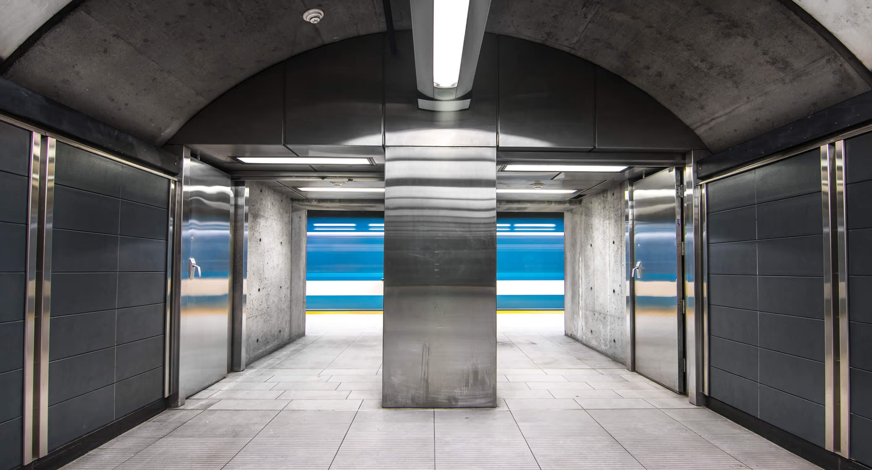
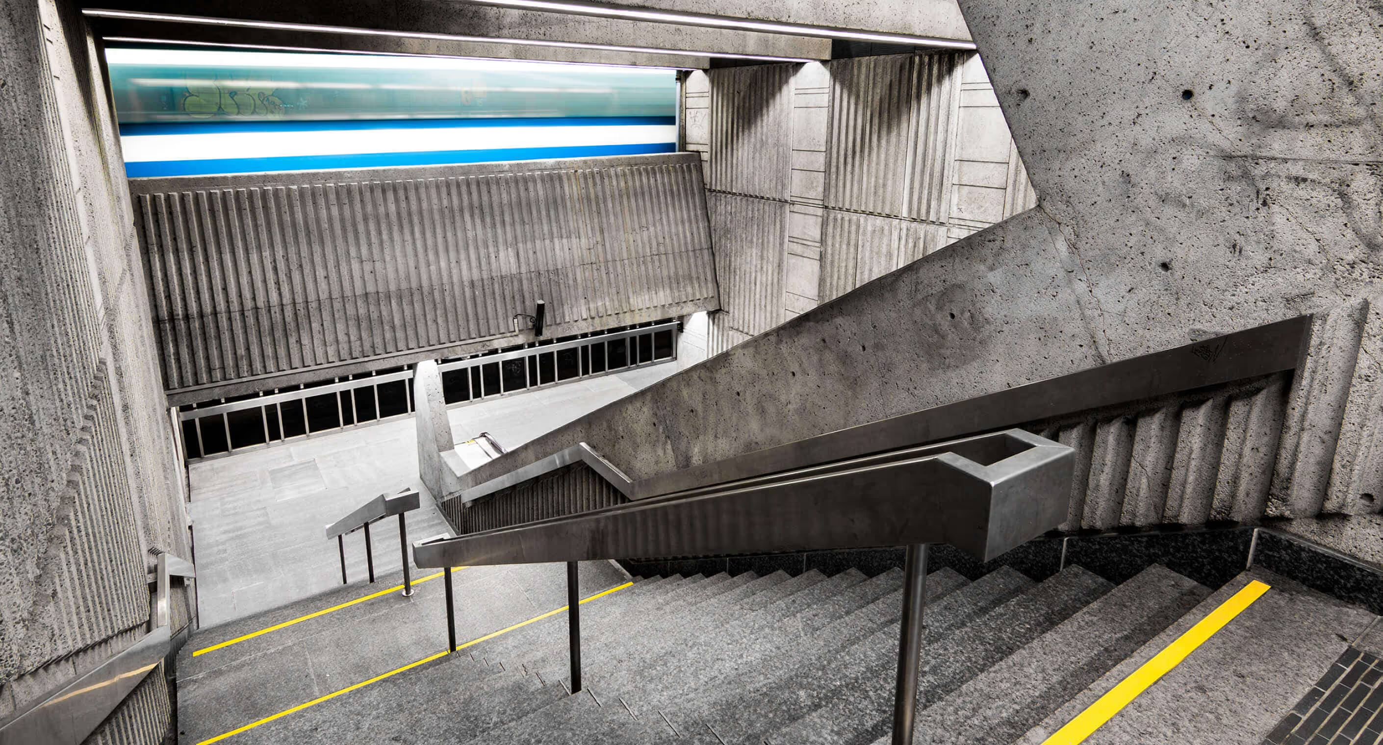
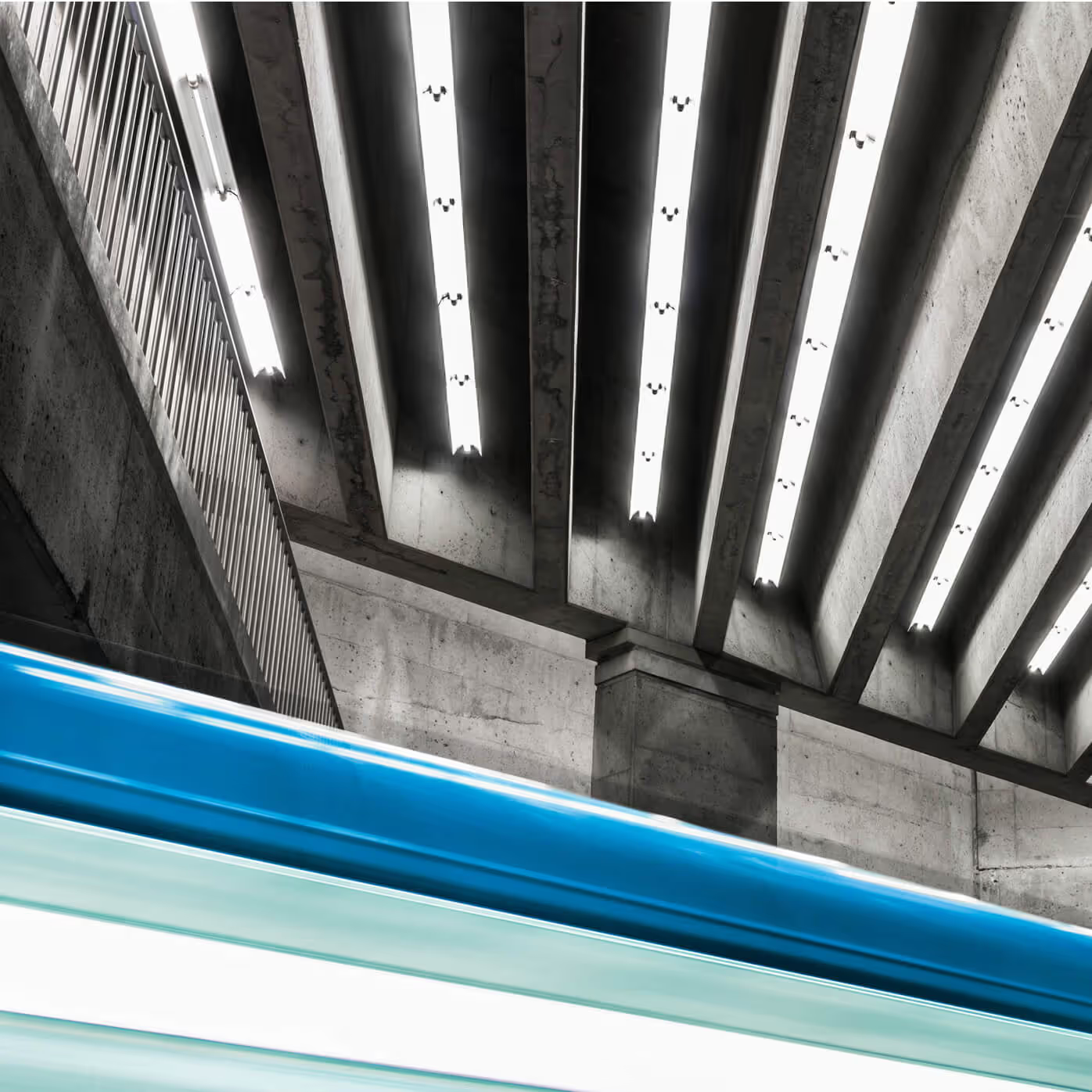
First two context shots:
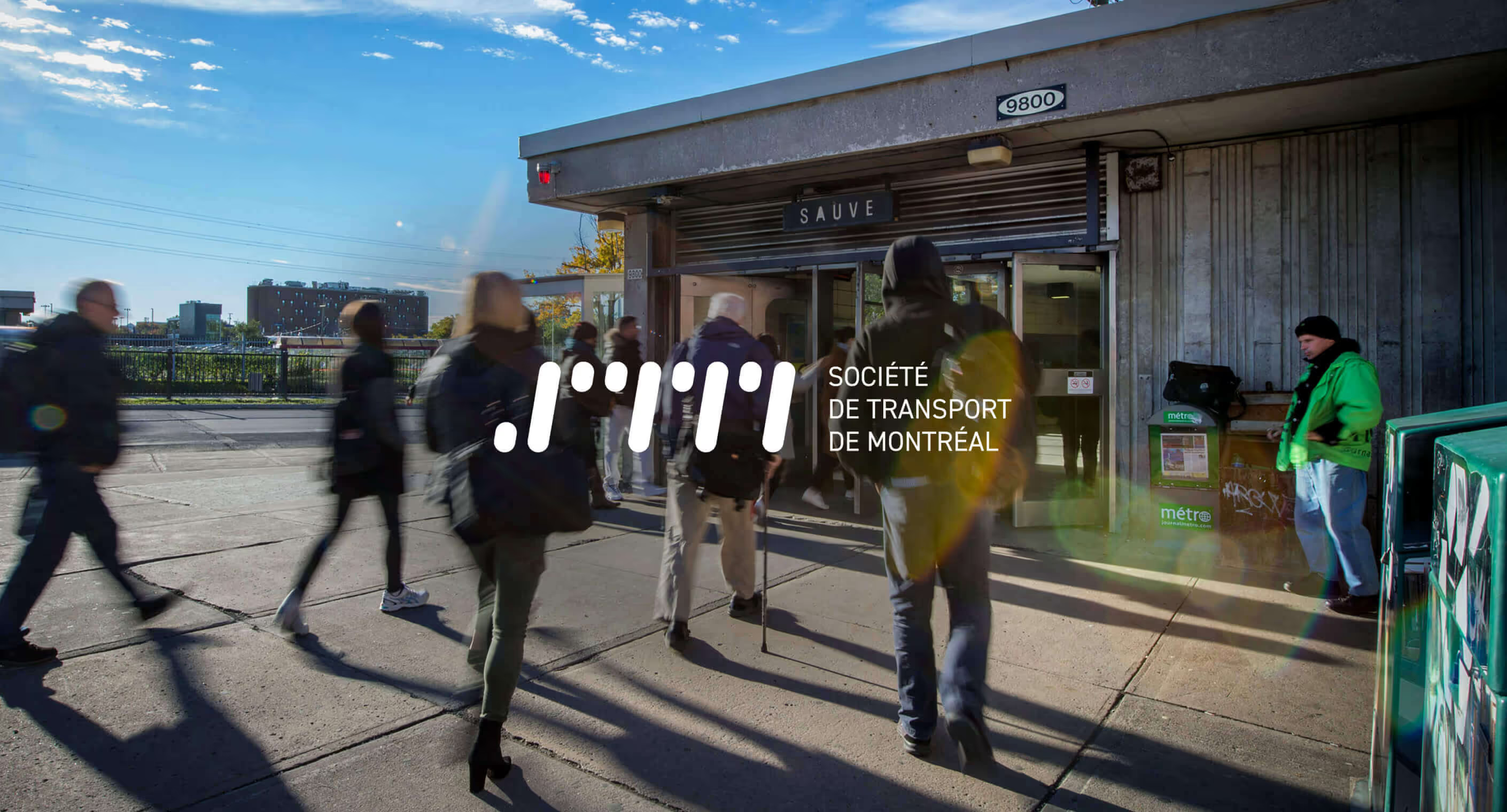
Source: La SDC District Central | Photographer: MIK
Other context shots: Photographer: Chris M Forsyth
PMS 2905 CP
CMYK 45, 1, 0, 1
RGB 141, 200, 232
HEX #8DC8E8
PMS 367 CP
CMYK 41, 0, 68, 0
RGB 164, 214, 94
HEX #A4D65E
White
RGB 255, 255, 255
HEX #FFFFFF
CMYK 0, 0, 0, 0
PMS 7 CP
CMYK 20, 14, 12, 40
RGB 151, 153, 155
HEX #97999B
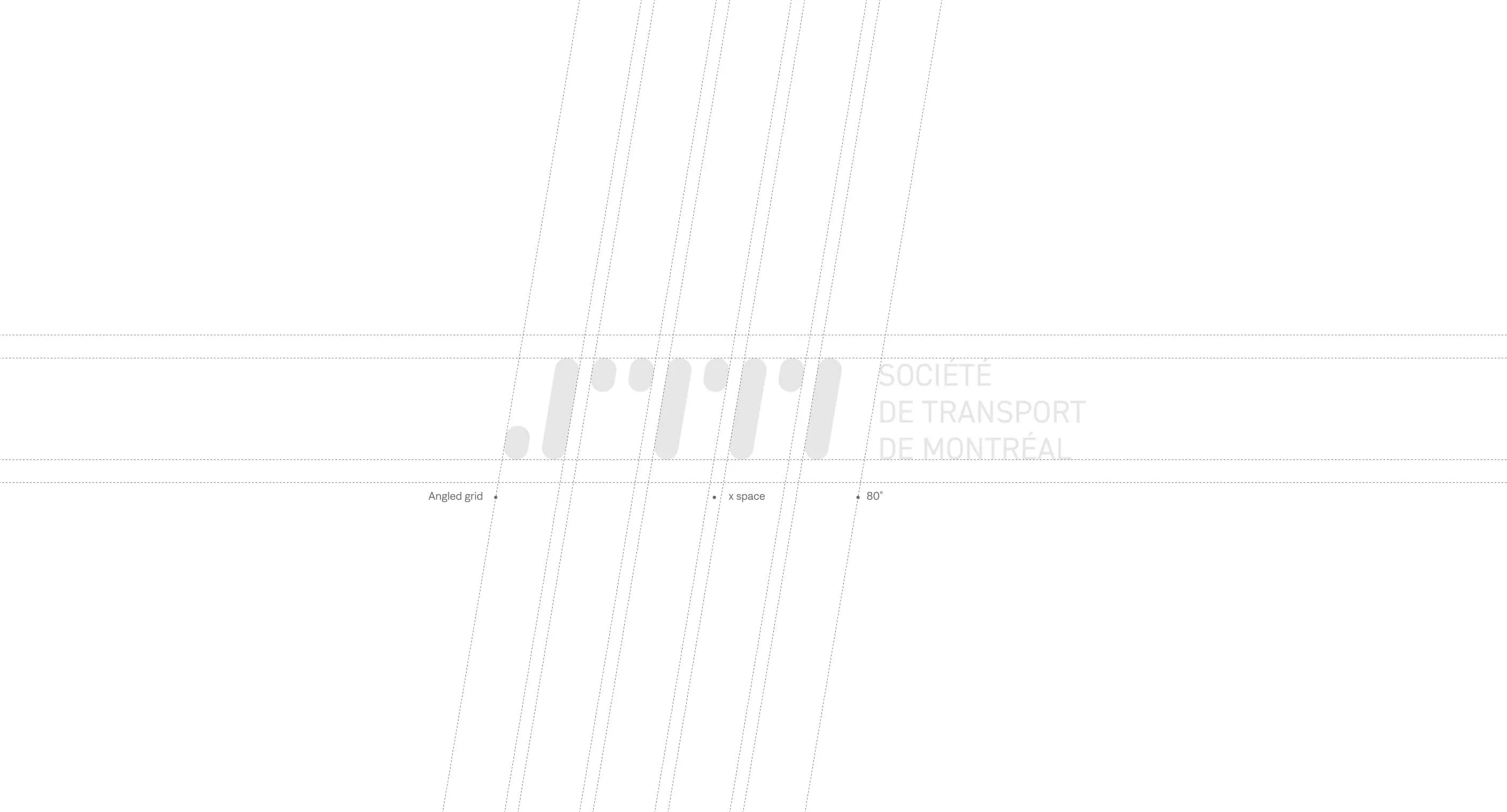
The logo needed to feel forward moving and true to the brand. I focused on clean geometry that implies motion through balance and proportion. Scalability was essential. The mark must work on a bus wrap, a transit card, and a digital screen. A restrained Pantone palette ensures consistency across every application. Montreal is expanding. The brand should feel the same momentum.
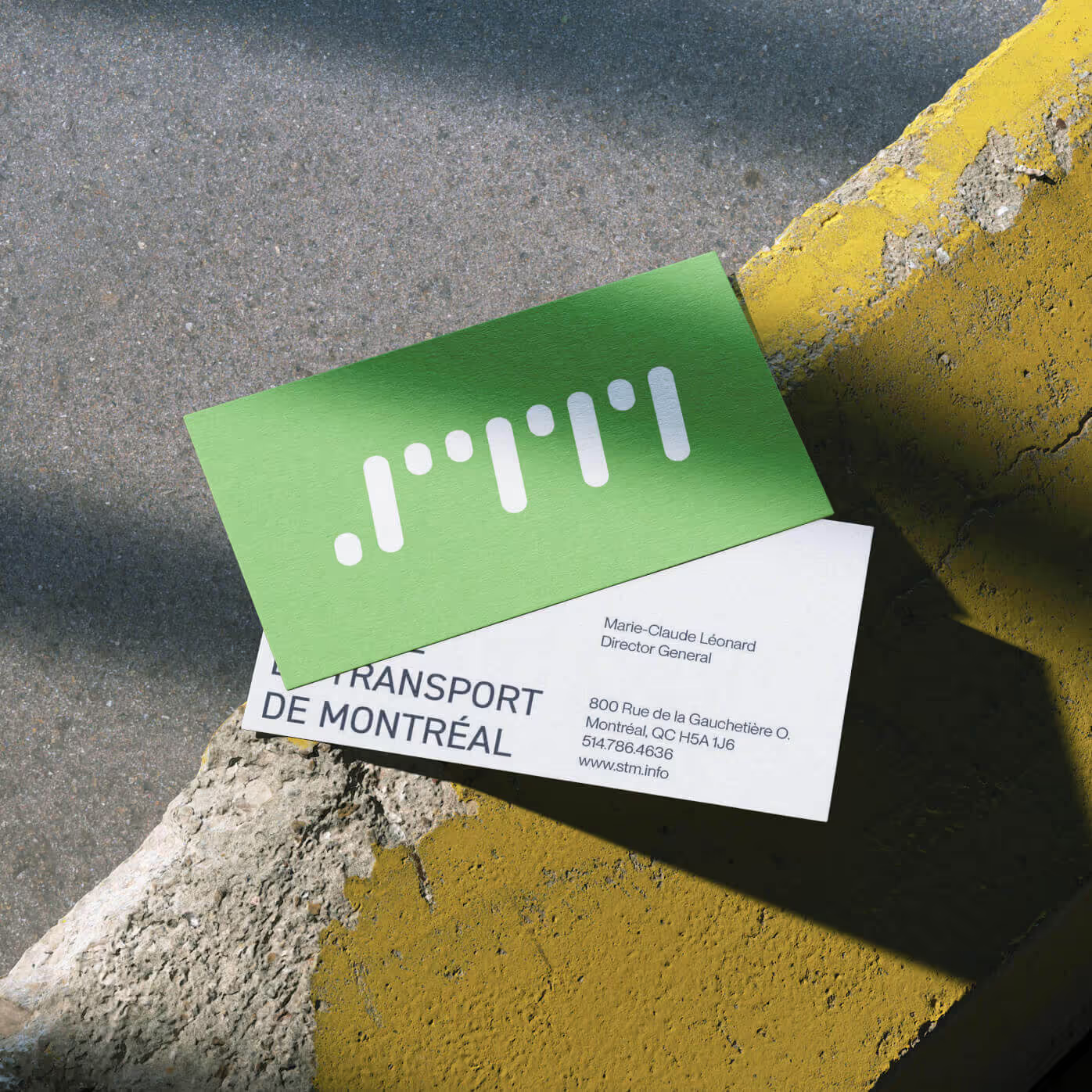
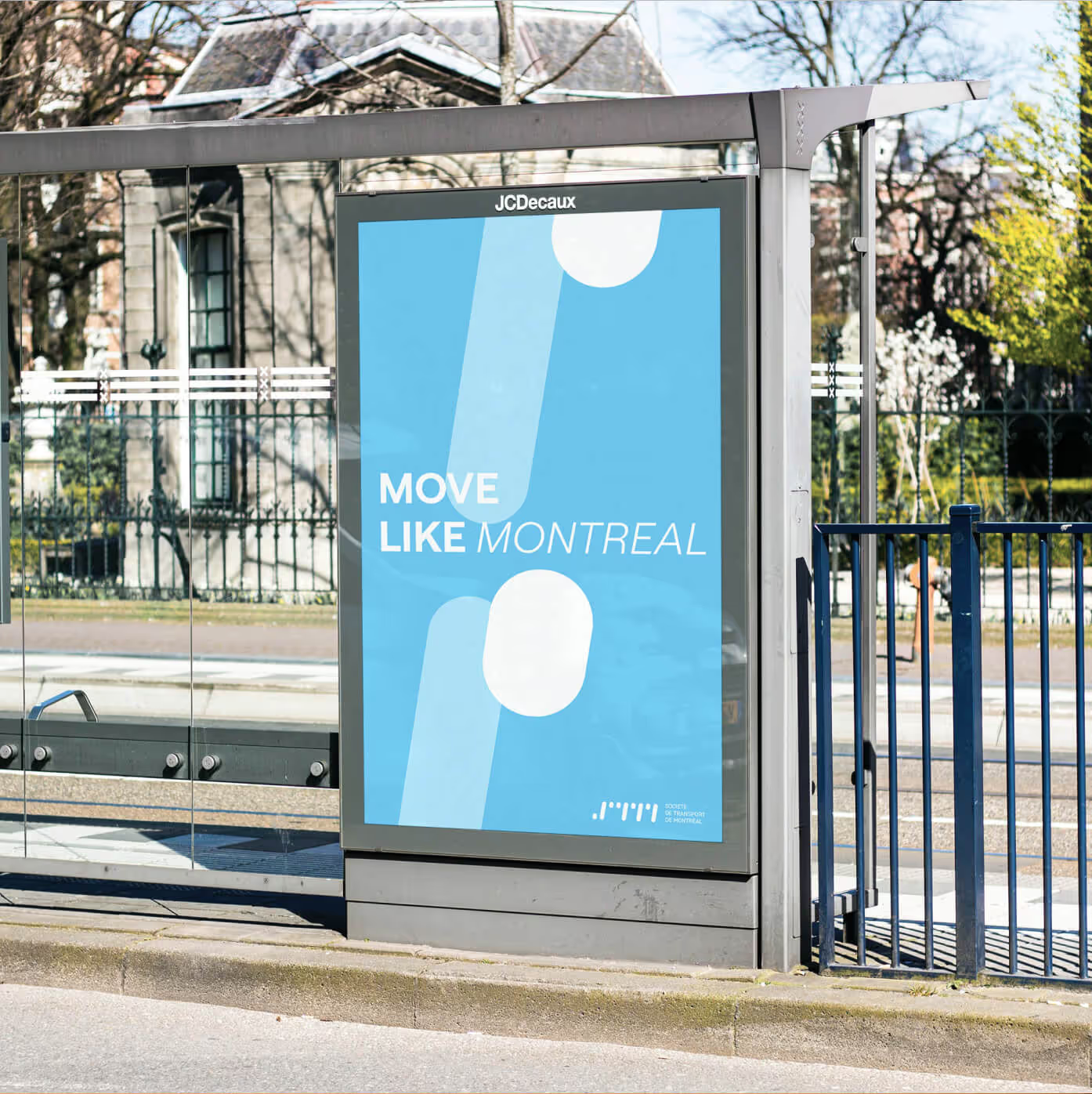
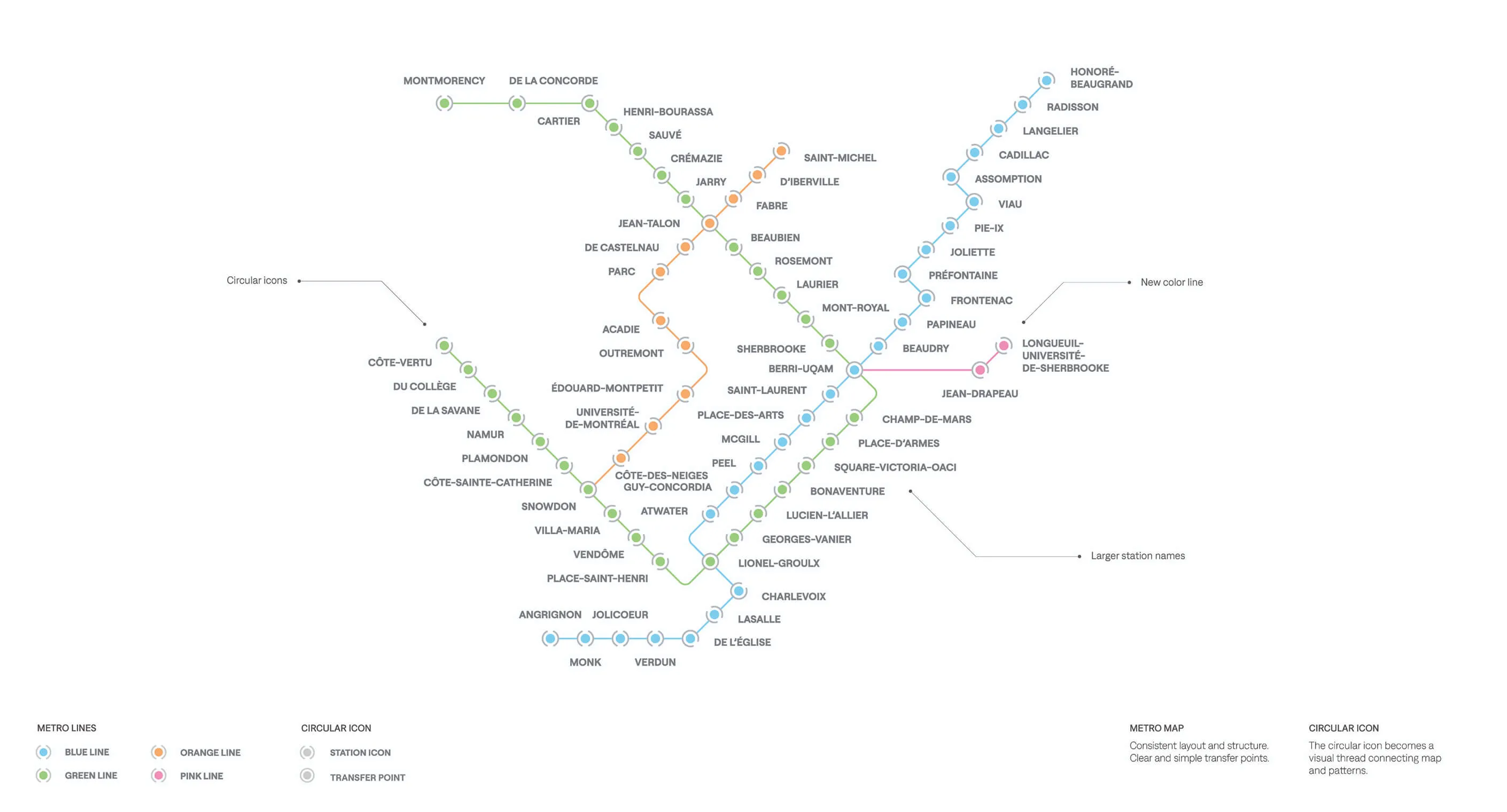
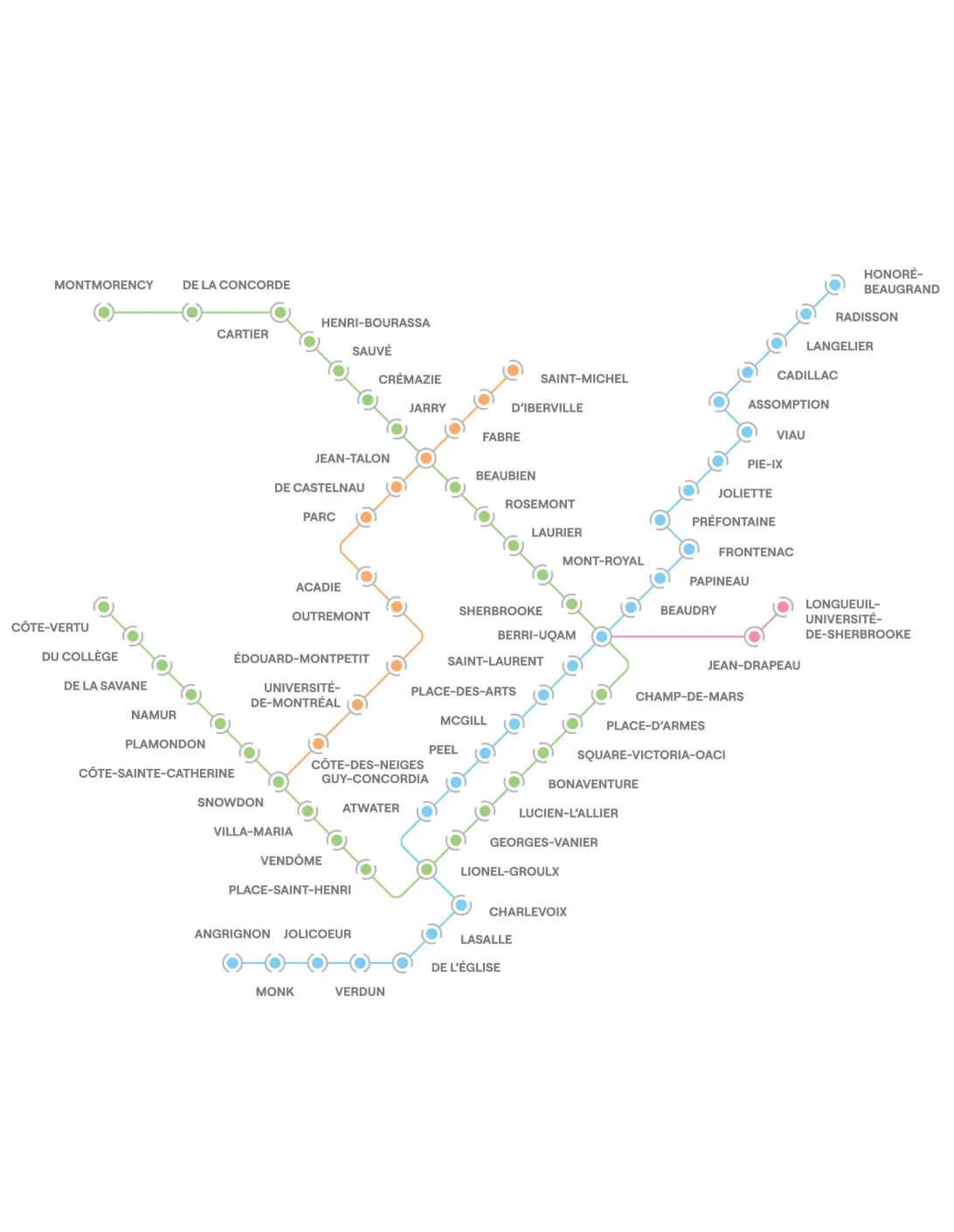
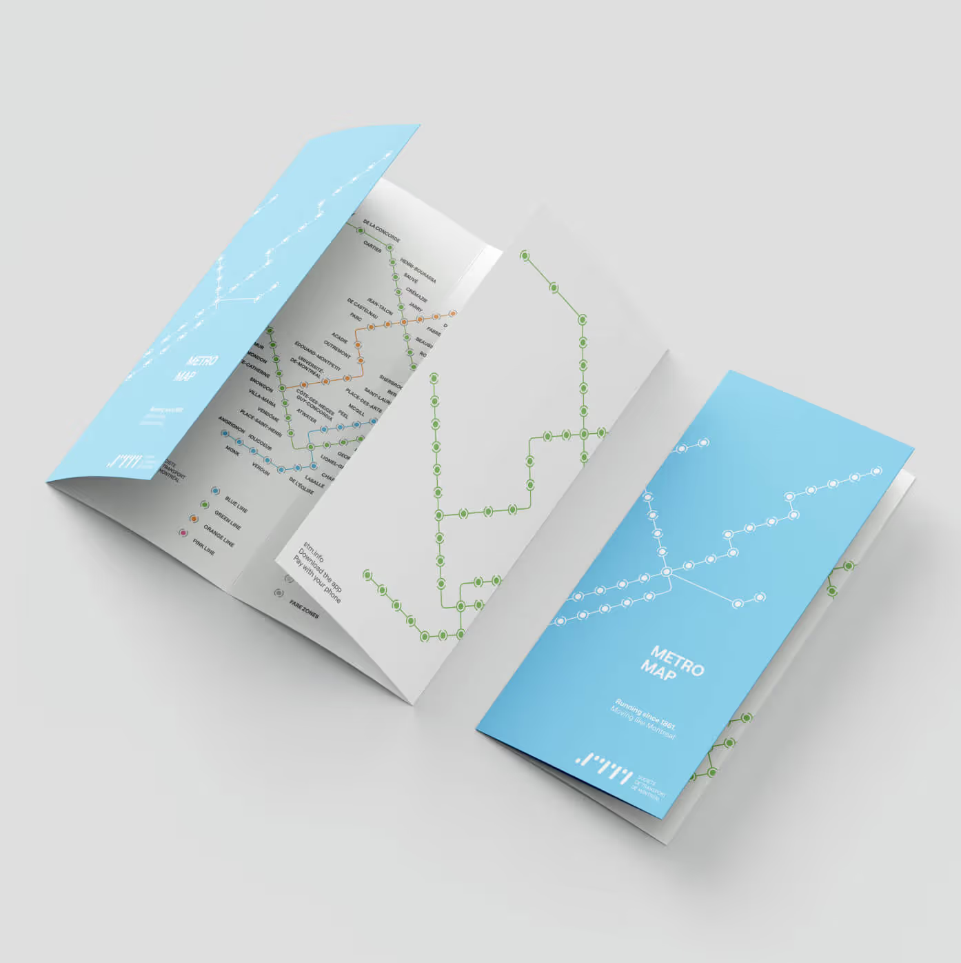
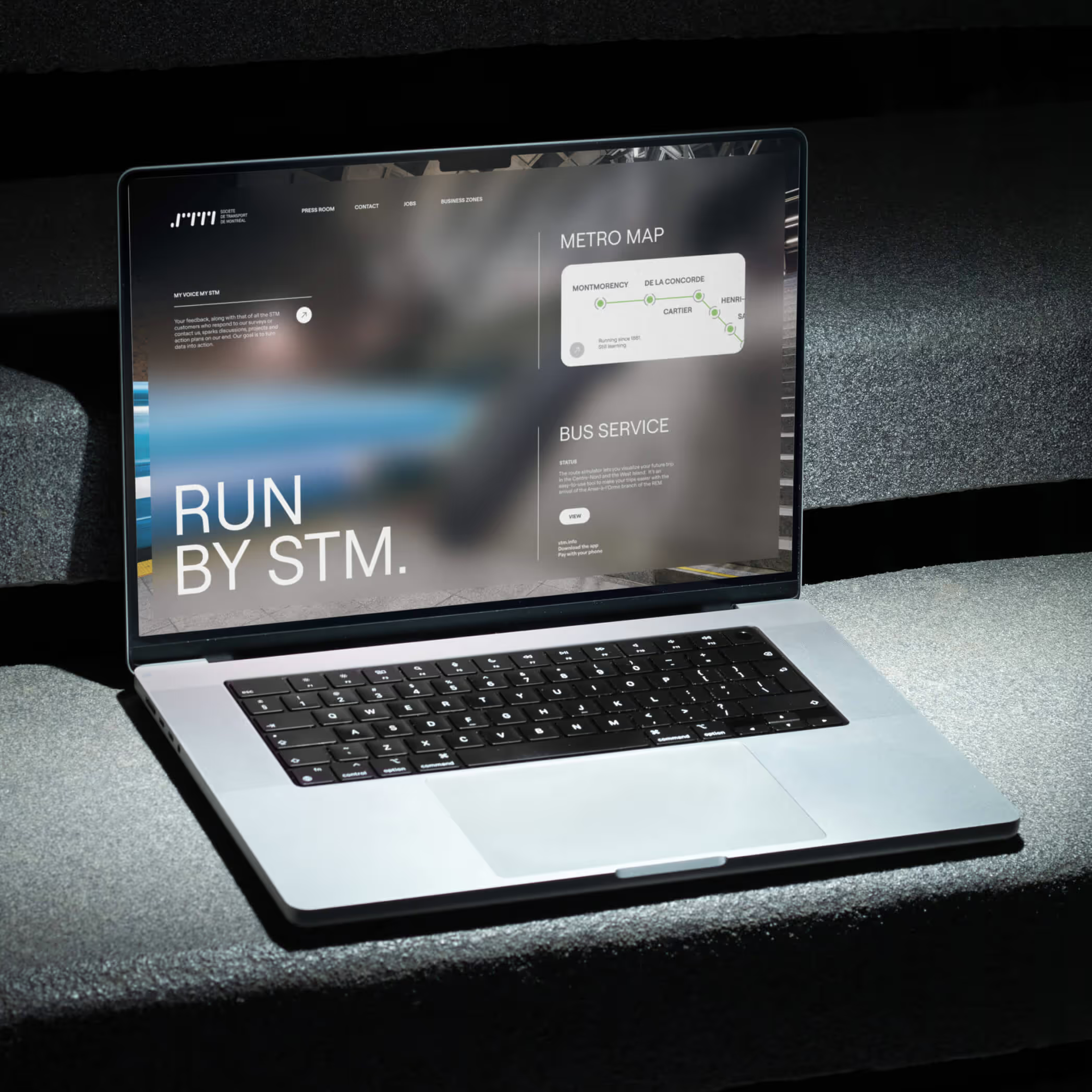
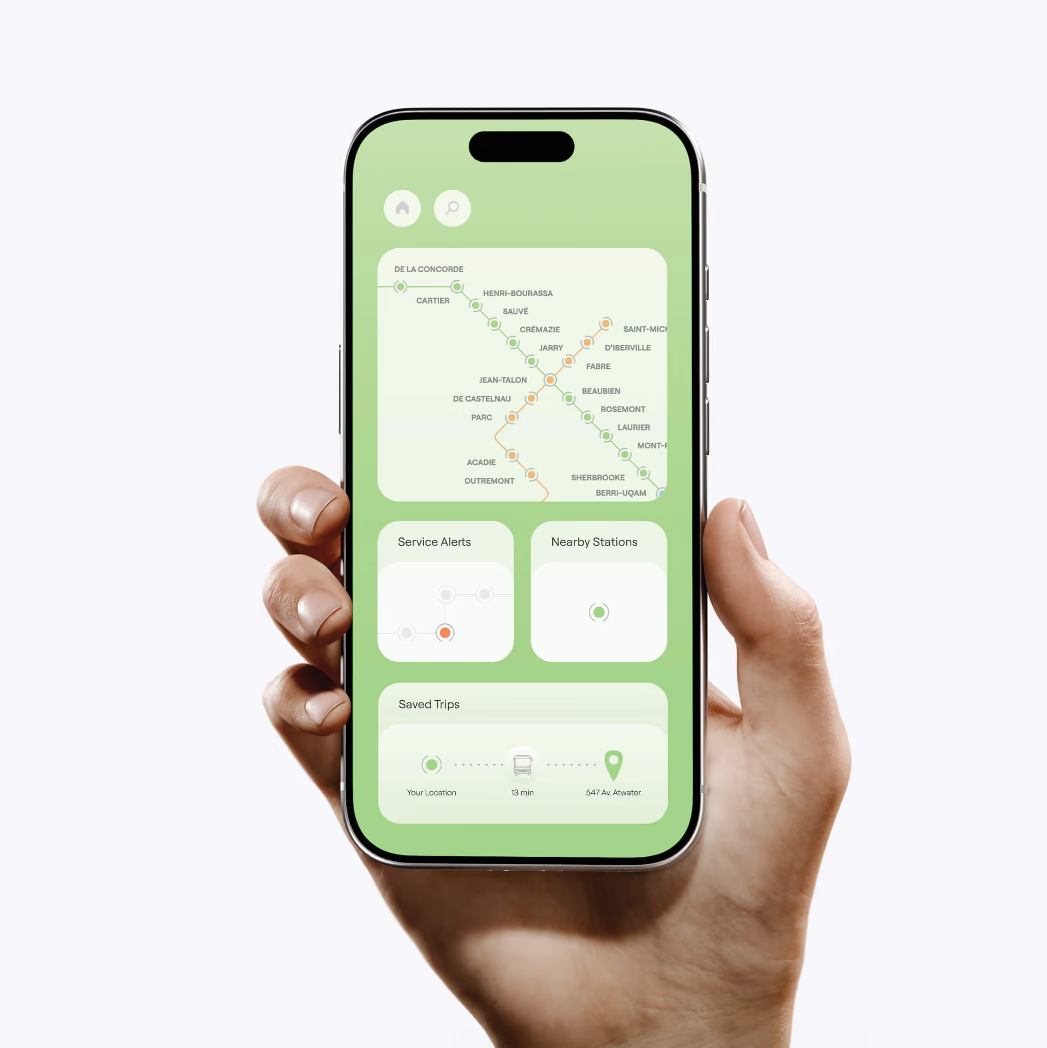
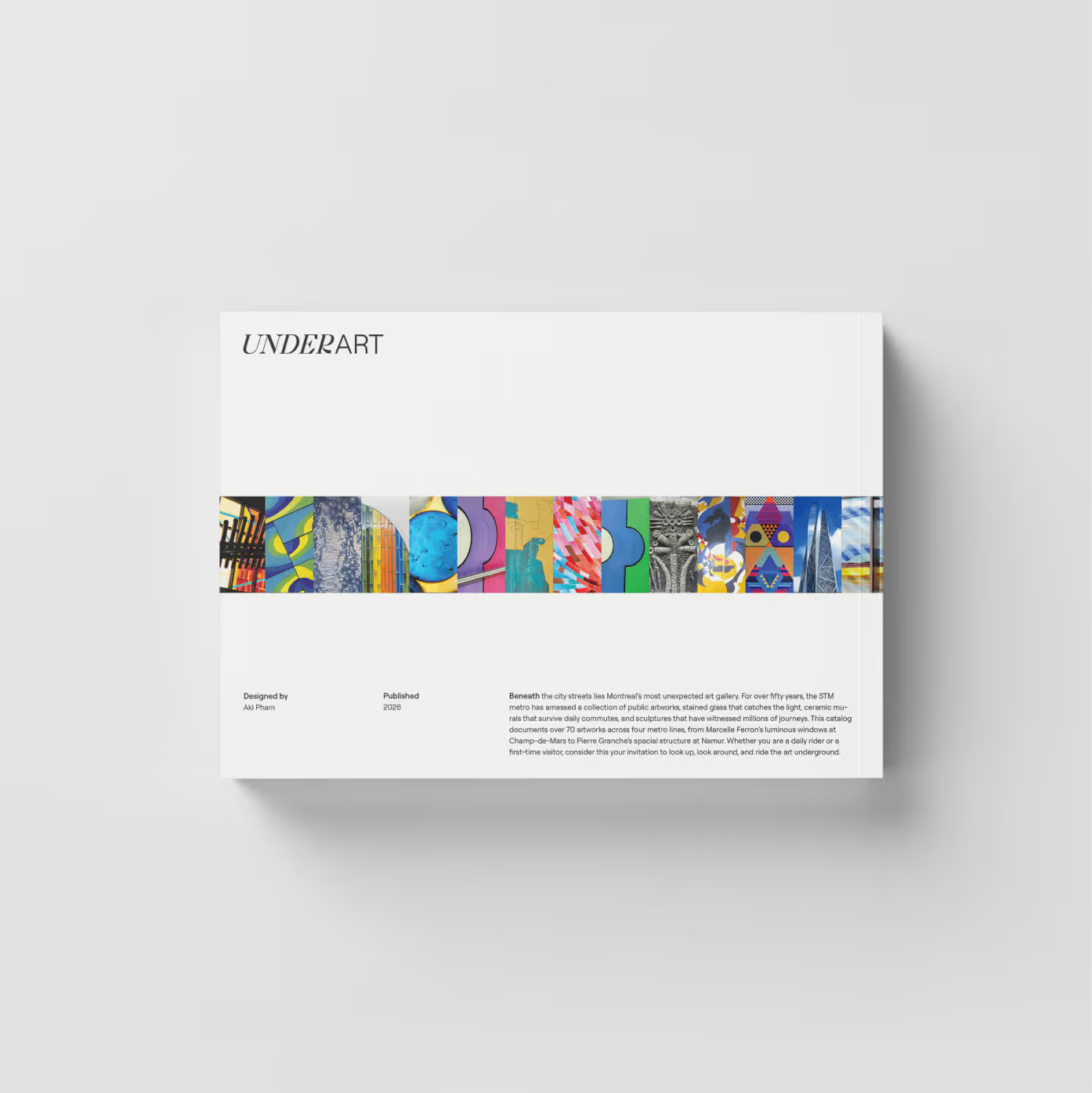
The identity now spans every touchpoint. Stationery, digital interfaces, advertising, and a fully redesigned modern transit map. The typography is cleaner. The hierarchy is clearer. The logo performs at every size, from the side of a vehicle to a mobile screen.
The system holds together because every decision was tested for scale, legibility, and application. The result is a unified system that makes STM feel like a modern civic network.